
Scratch
Scratch is a financial technology company making loan management and repayment simpler and more approachable.
Working alongside the lovely team at Simple as Milk, I helped shape Scratch’s visual identity from the ground up, creating a playful system spanning illustration, iconography, web and print. From website illustrations and marketing campaigns to event booths and swag, the system grew across the entire brand, bringing warmth, personality and a distinctly Scratch feel to every touchpoint.
Making loan management feel a bit more approachable.
Services
• Branding
• Creative direction
• Illustration system
• Character design
• Iconography
• Web + campaign illustration
Year
2017 - 2021

Building the Scratch brand
I worked closely with the Scratch creative team to evaluate the existing brand, and together we built a brief that gave us a clear starting point.
EmpoweringGiving borrowers clarity and control over their debt.
DirectMaking complex information clear and easy to understand.
RelatableMaking reducing debt feel achievable, not intimidating.
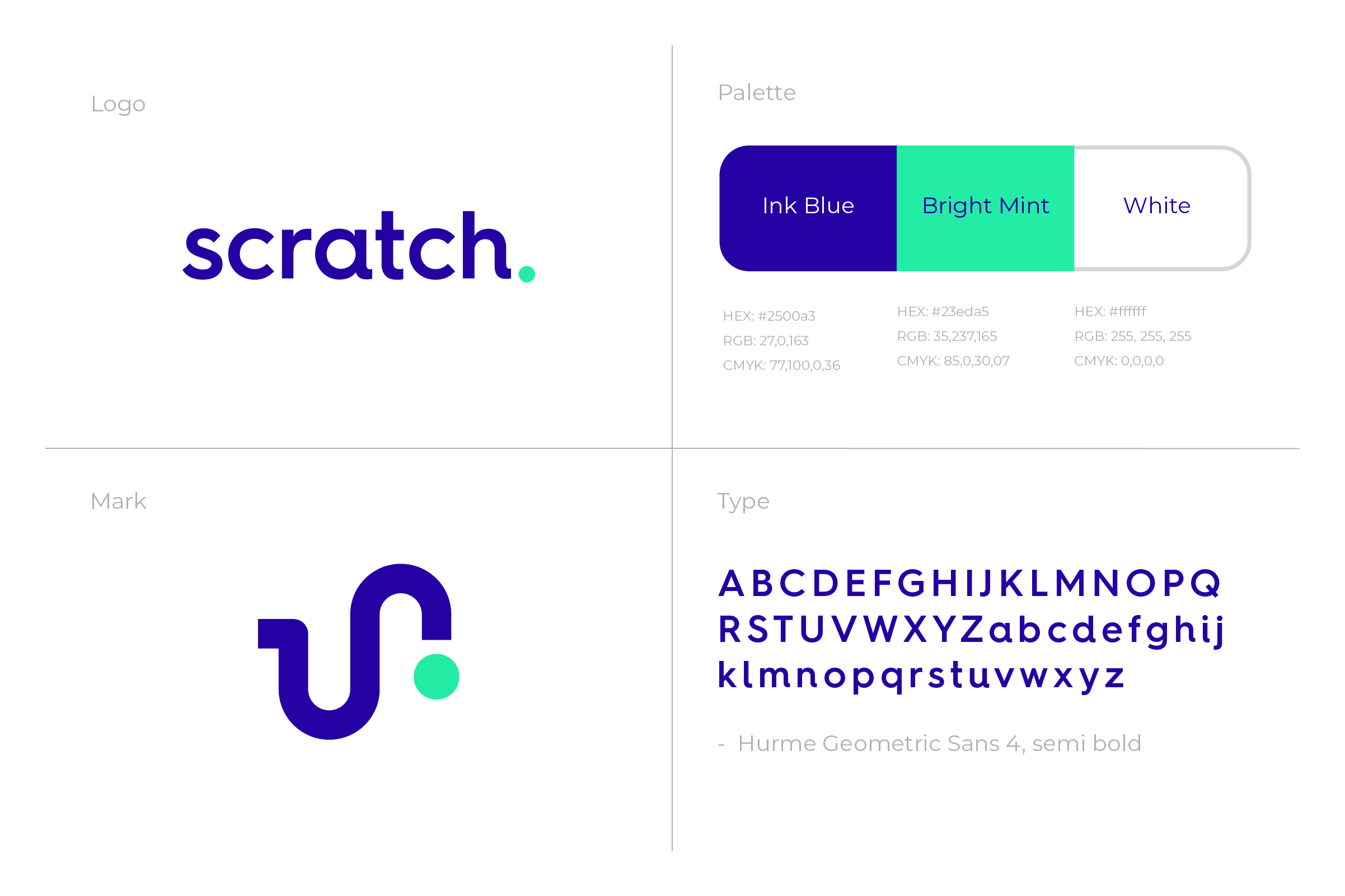
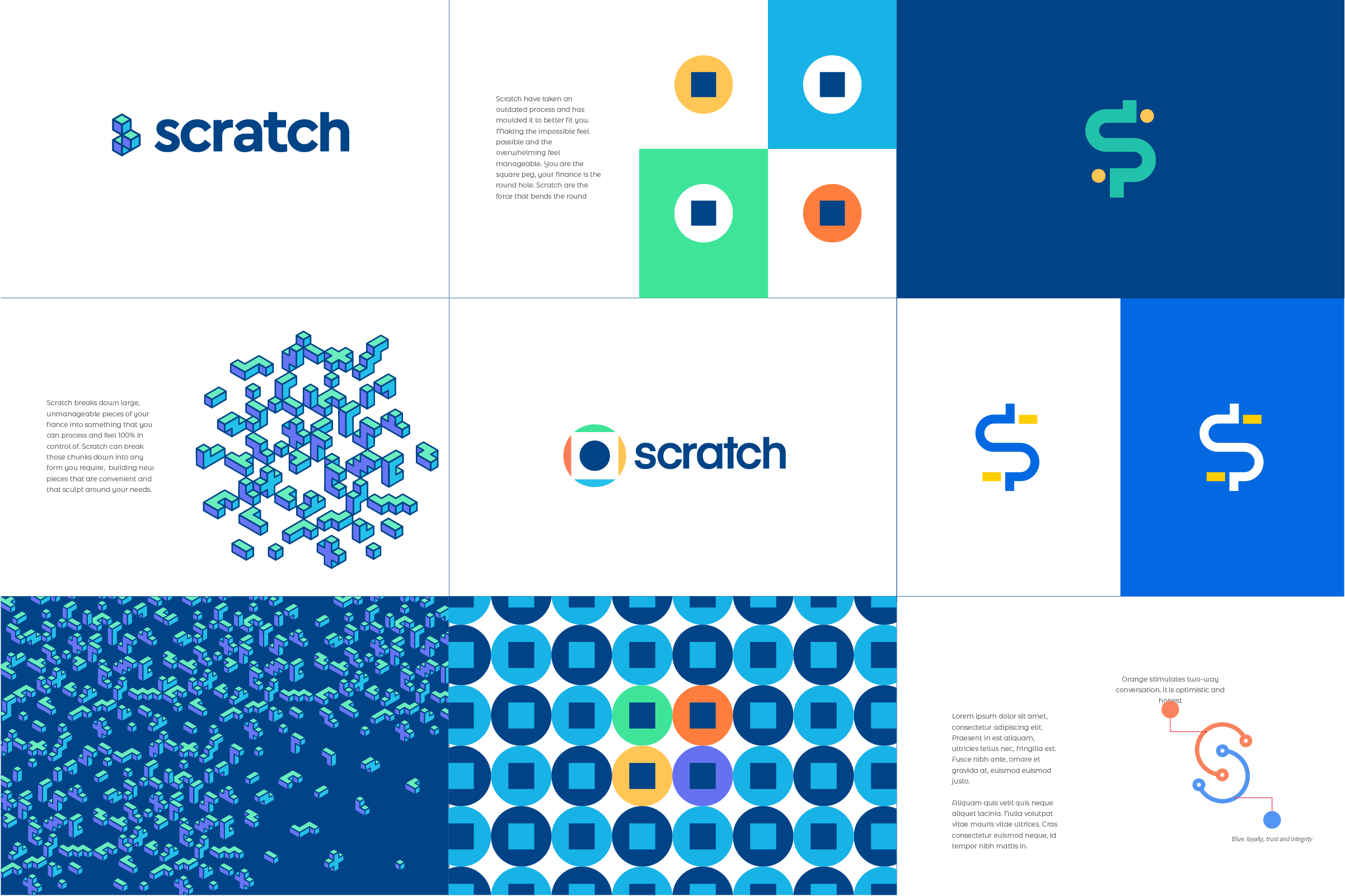

The exploration phase of this project was quite extensive, digging into the why and how behind the brand. Finding the right balance between approachable and trustworthy, while still feeling professional and direct, took us on quite a journey. After plenty of exploration, the client and I landed on something we were both extremely happy with.
With the brand foundations in place, it was time to get stuck into the world of Scratch. Illustration, iconography, characters and visual storytelling would bring the brand to life. After being knee-deep in the brand for weeks, I was ready to take everything we’d built to the next level, starting with the illustration style.
↟Finding the Style ᨒ
World Building
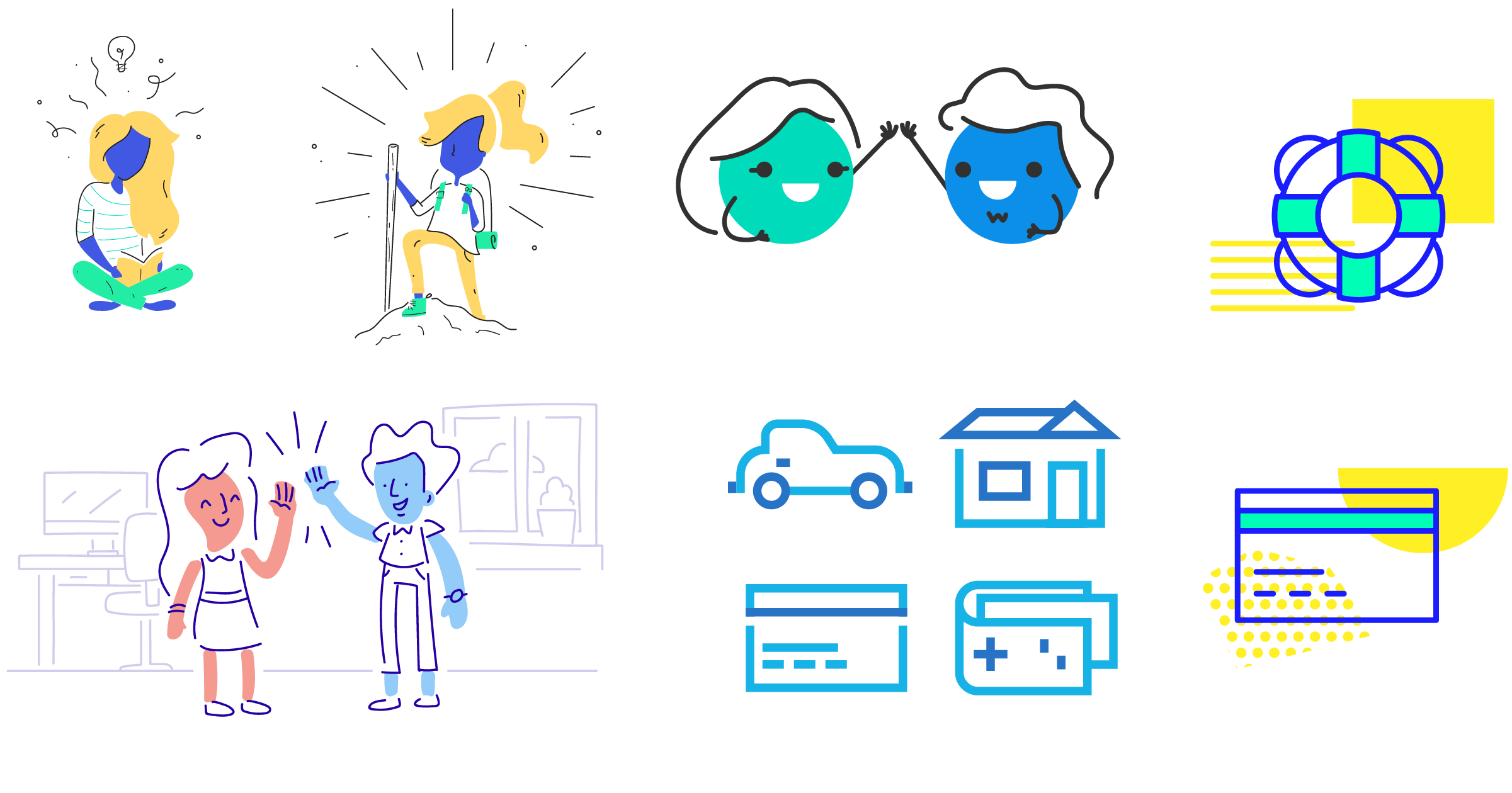
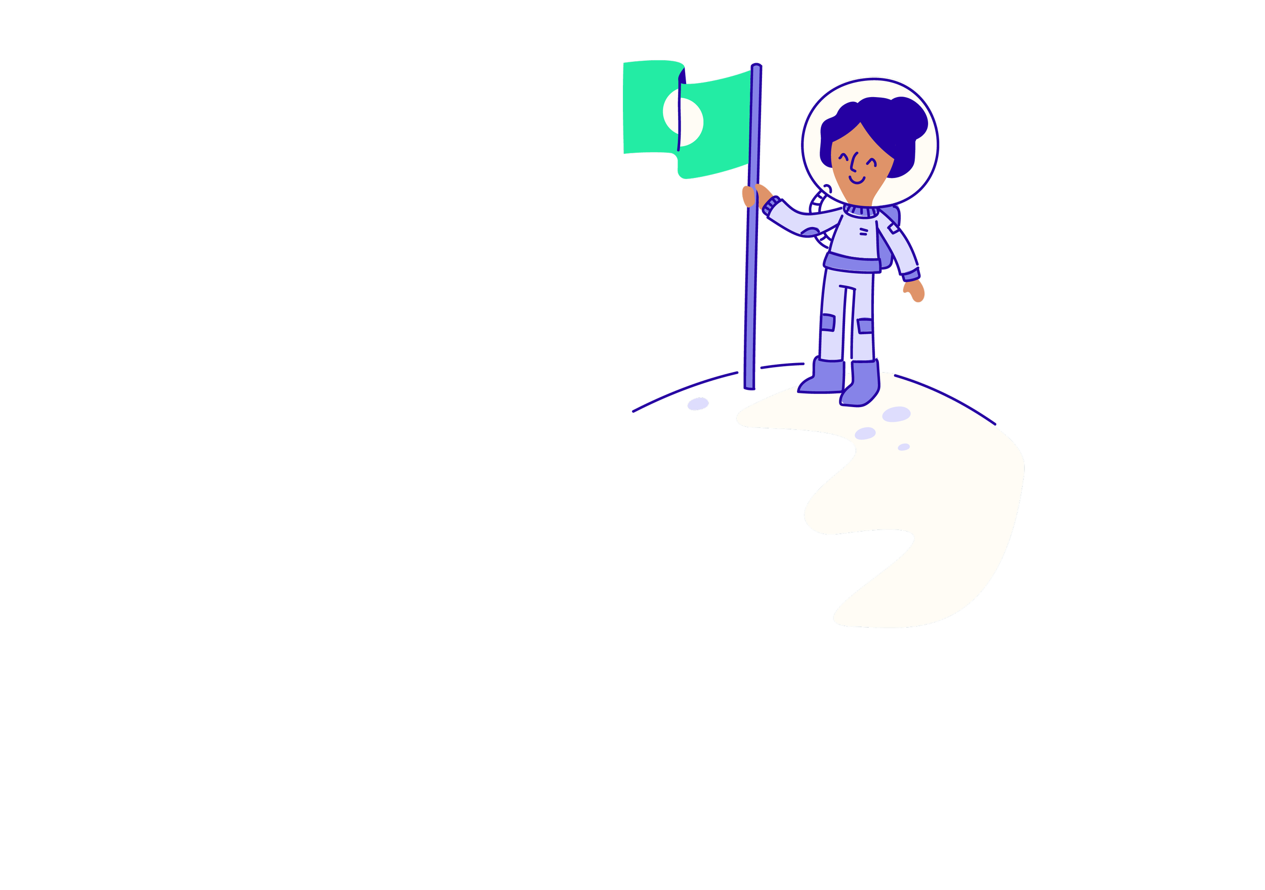
I tested out a bunch of visual options here. Finance is a subject that can feel quite heavy and detailed, I wanted to bring characters in at the right moments, while letting iconography do the heavy lifting when simplicity was needed.
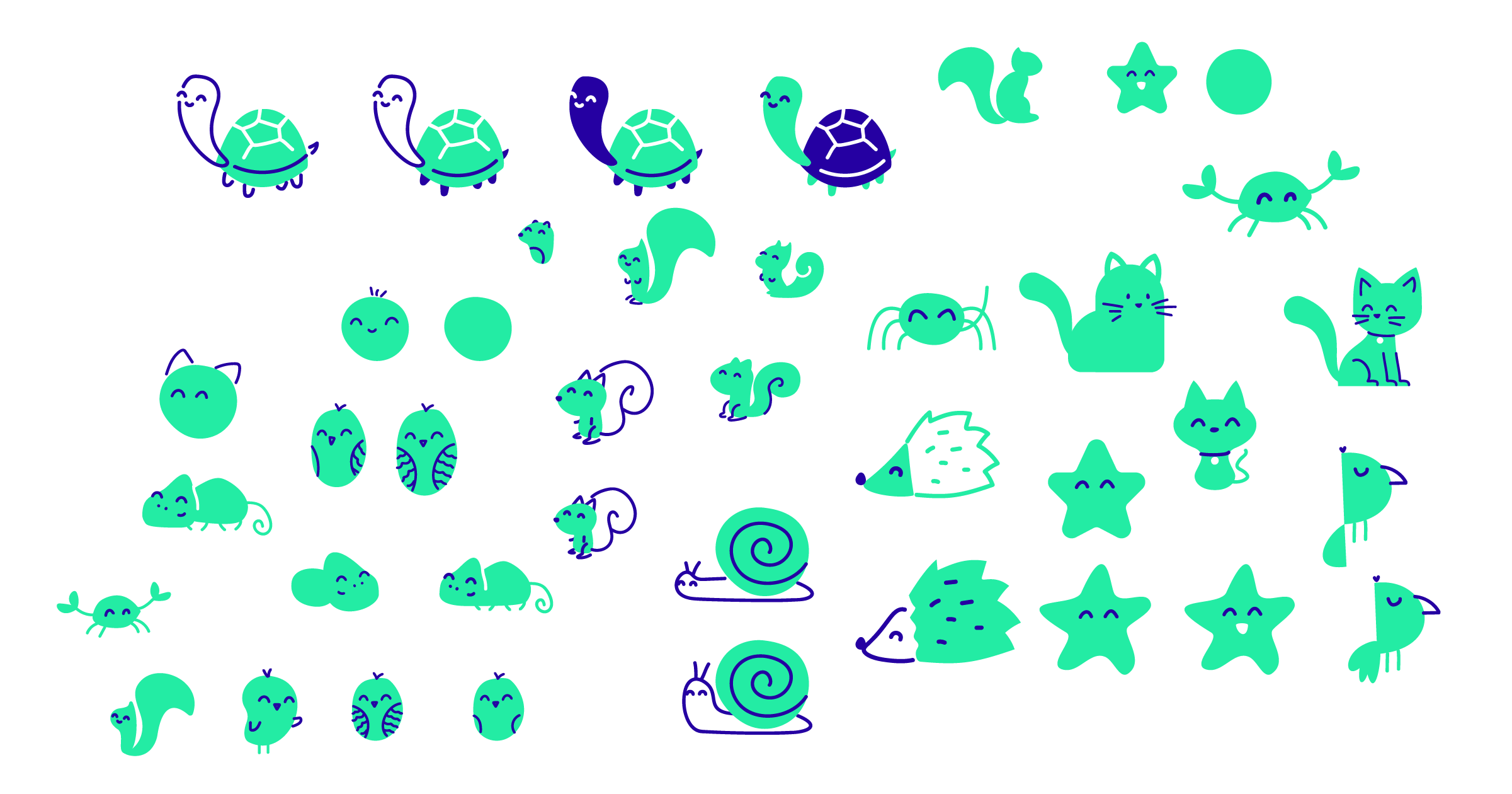

Side Quest: Plz hire me to draw cute mascots
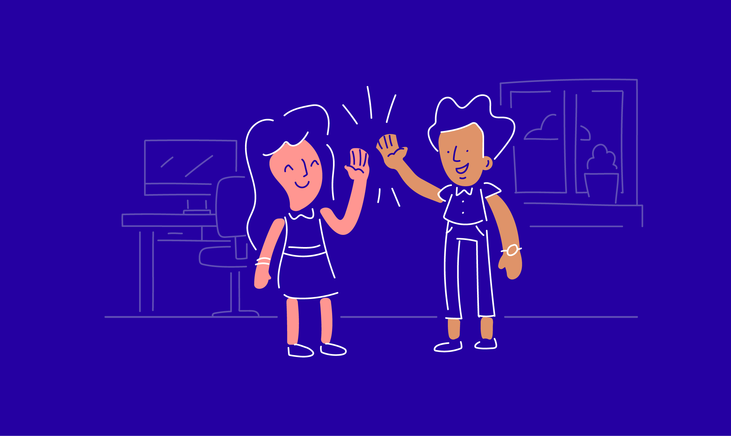
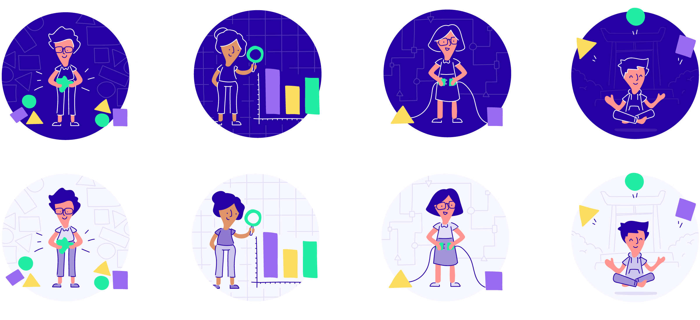
The style started to come together naturally, with the brand values helping me focus on what this world should look and feel like, how colour was used and the level of detail to include. The main focus was to make sure the illustrations could break down complex stories and tell them quickly, with heart.
A system in use
಄ The System 𖧧
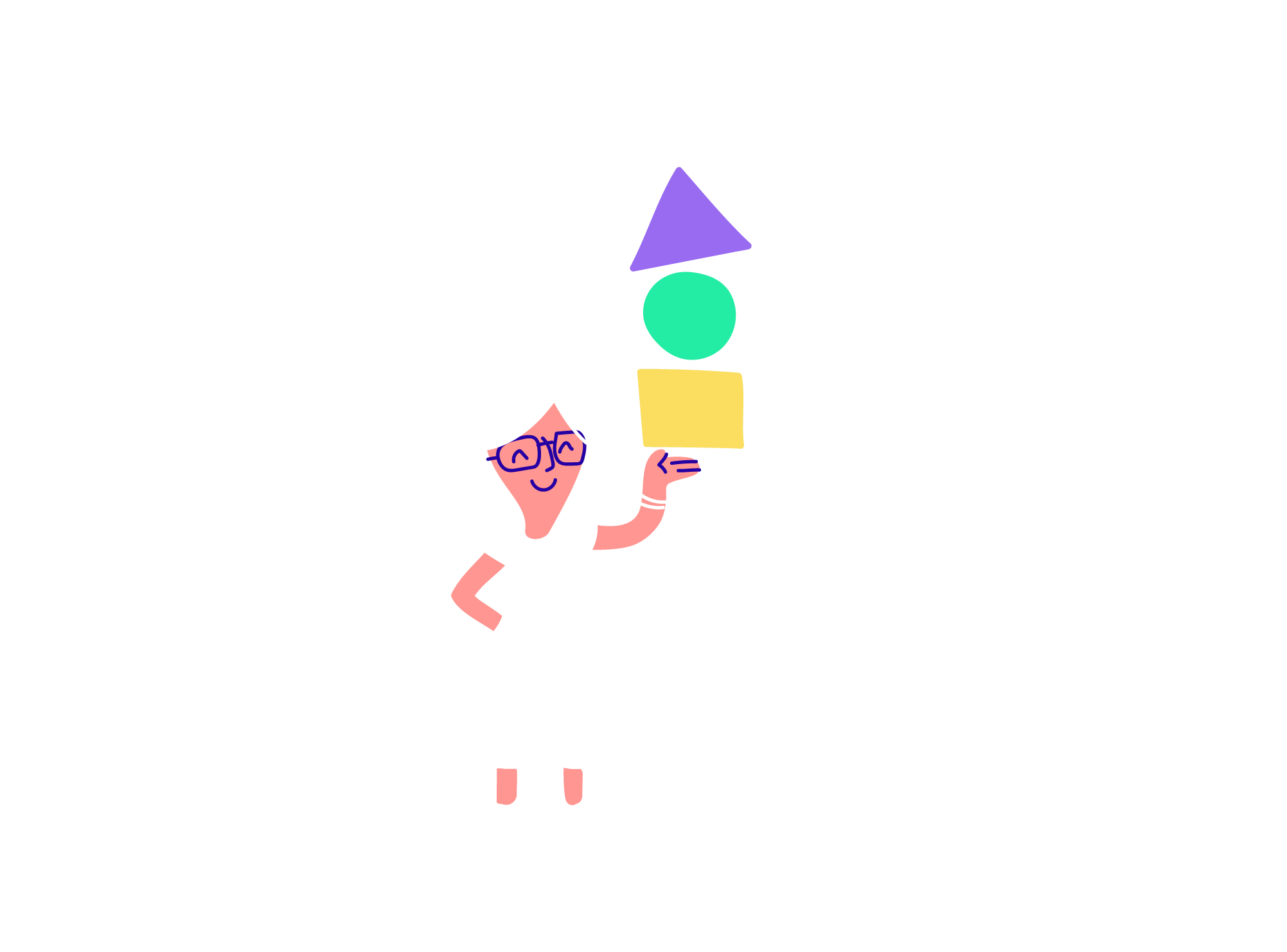
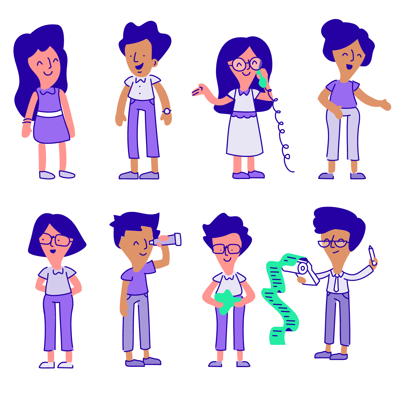
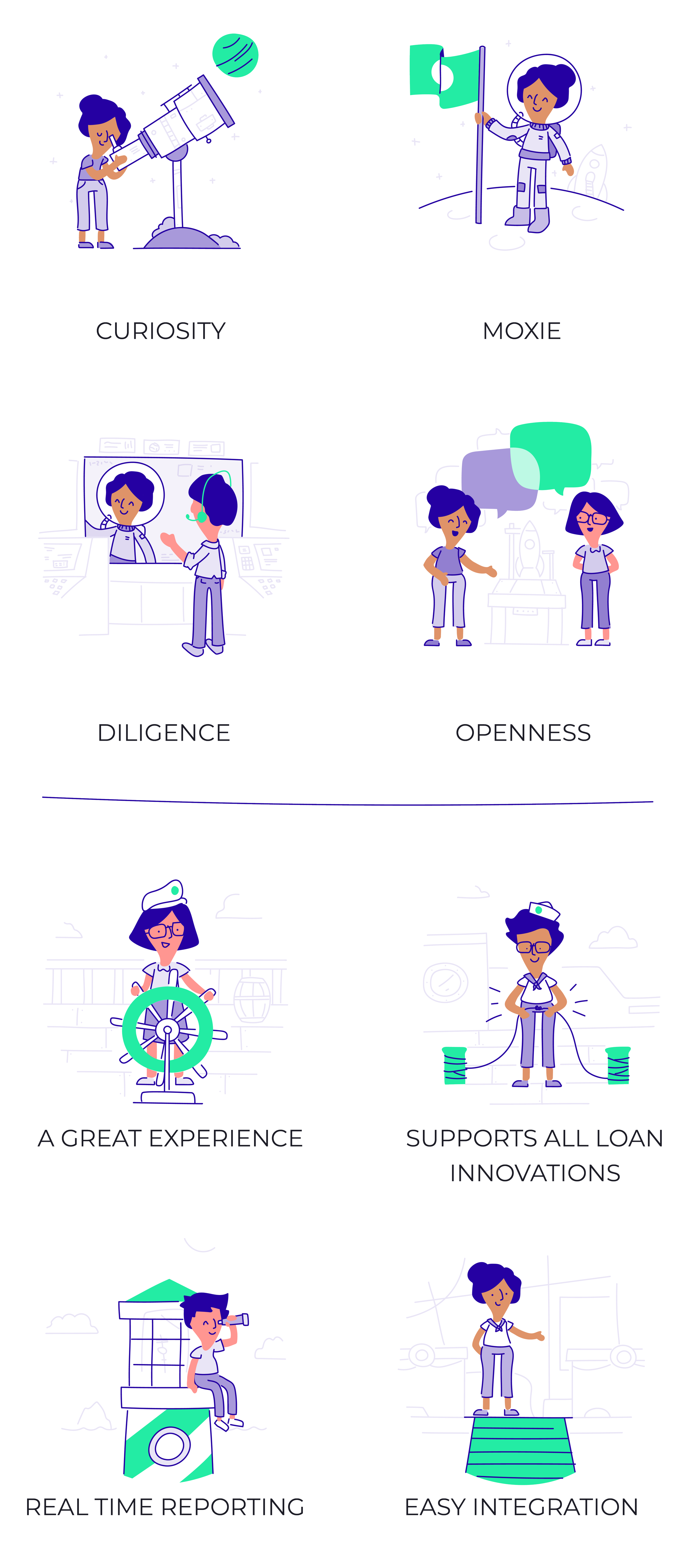
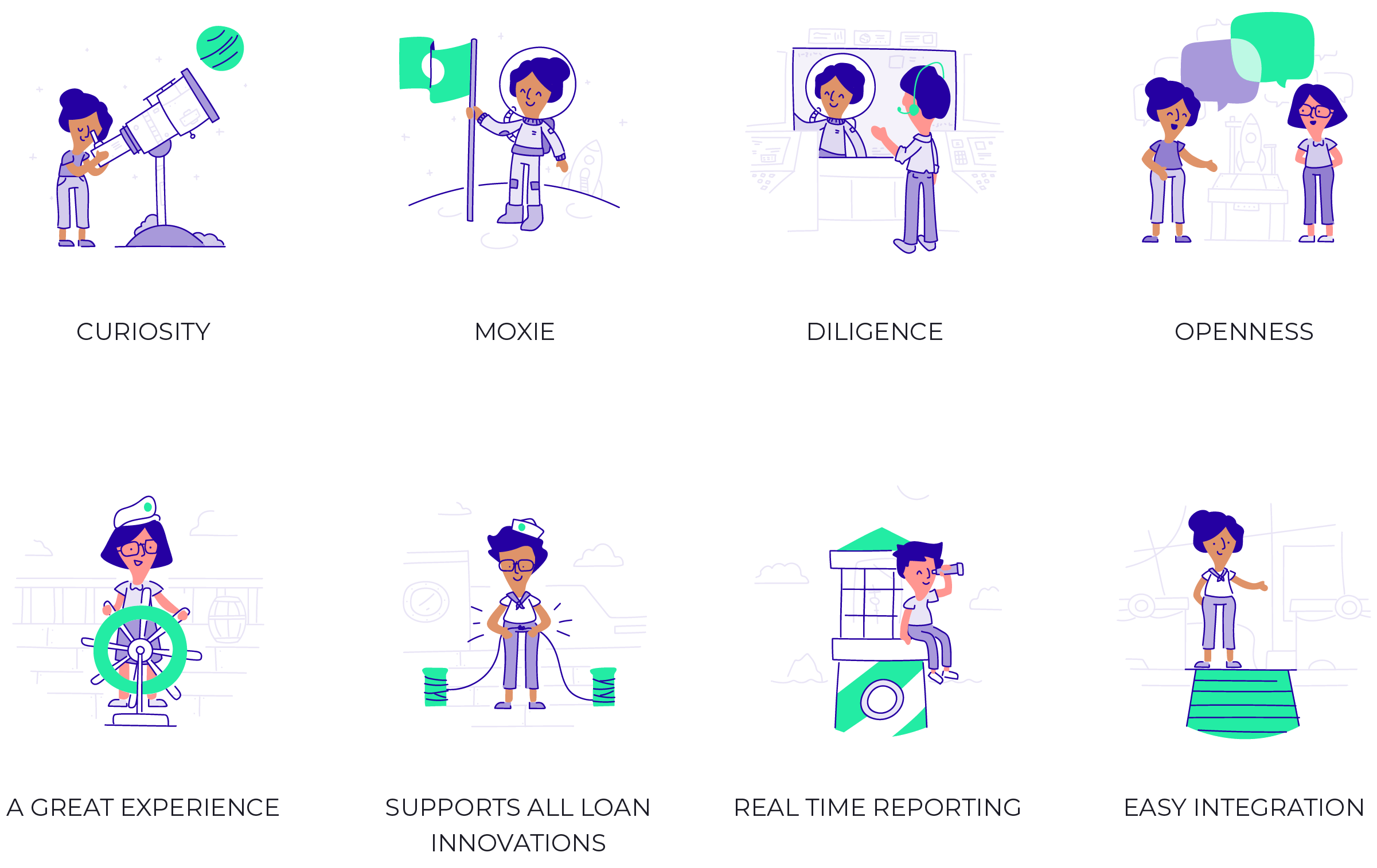
The style was in a great place at this stage, and both the client and I were incredibly happy with how the brand was coming together. Next up was building a robust illustration system that could work across web, brand, marketing and events, while staying flexible enough to grow wherever the brand needed it.
Characters.
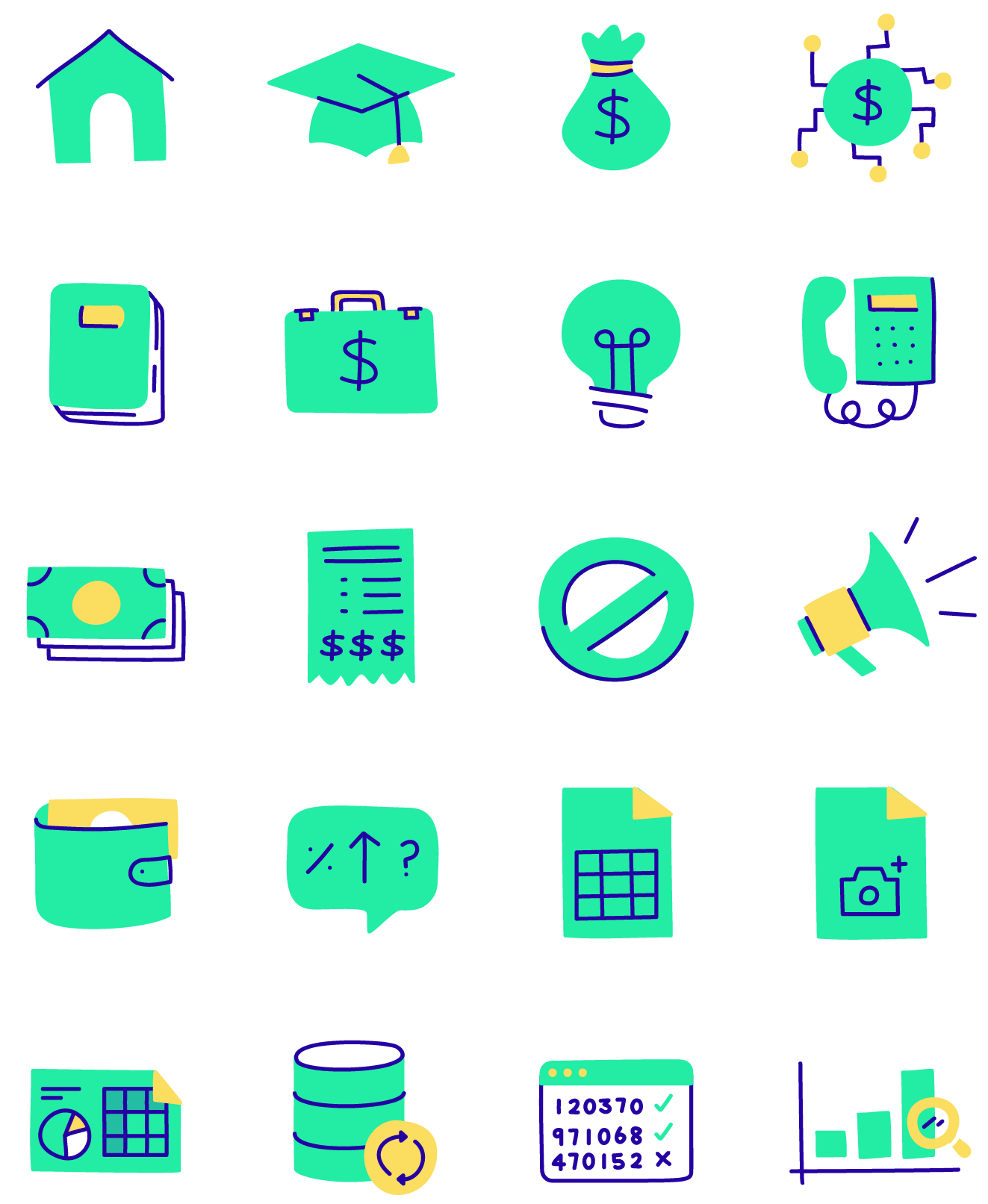
Iconography
Story
In The World
✽ in the world 🜸
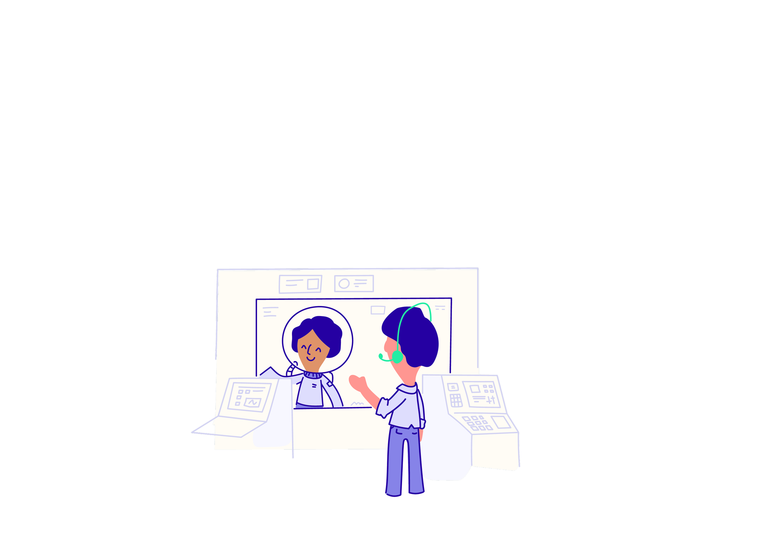
With the illustration and brand system in place, it was time to put it to use. From the website and app to event booths and swag, the Scratch world came to life across all kinds of touchpoints.
A journey made simple
Managing debt can feel like a daunting journey, so I wanted to make the experience feel a little more approachable. Using playful character design, winding pathways and illustrated environments, we brought Scratch's brand illustration system to life across the website, creating a visual story that made navigating loan repayments feel a little less intimidating.
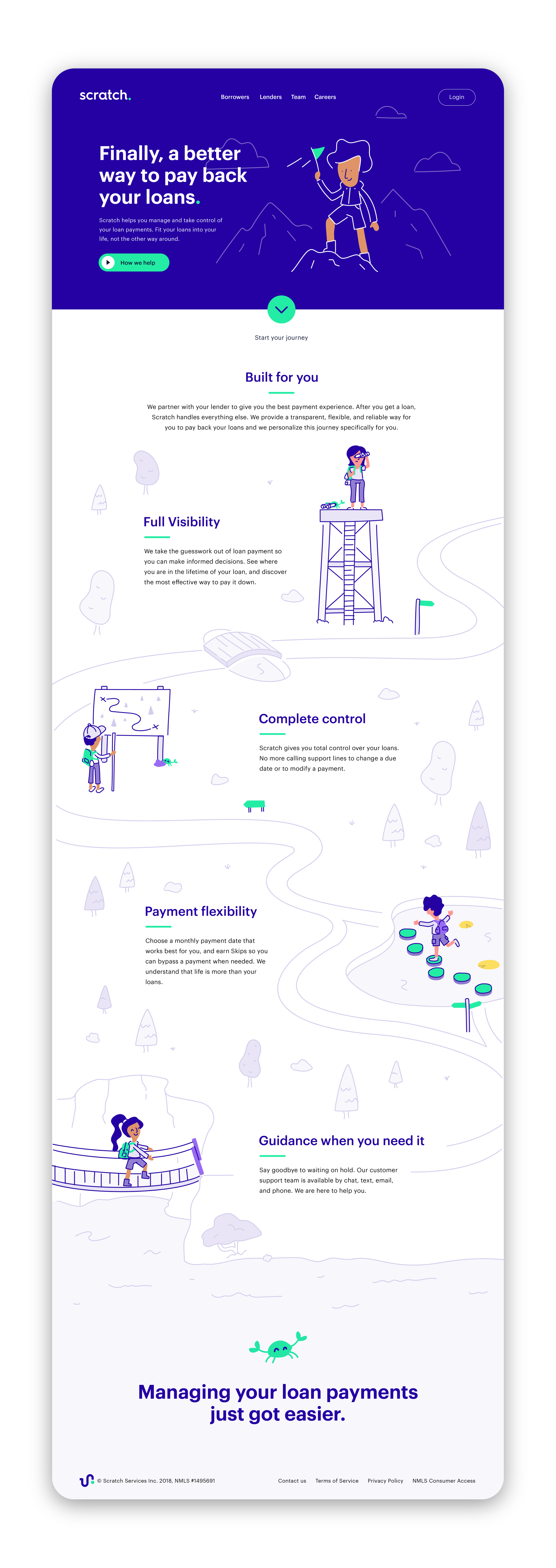


An Evolving Identity
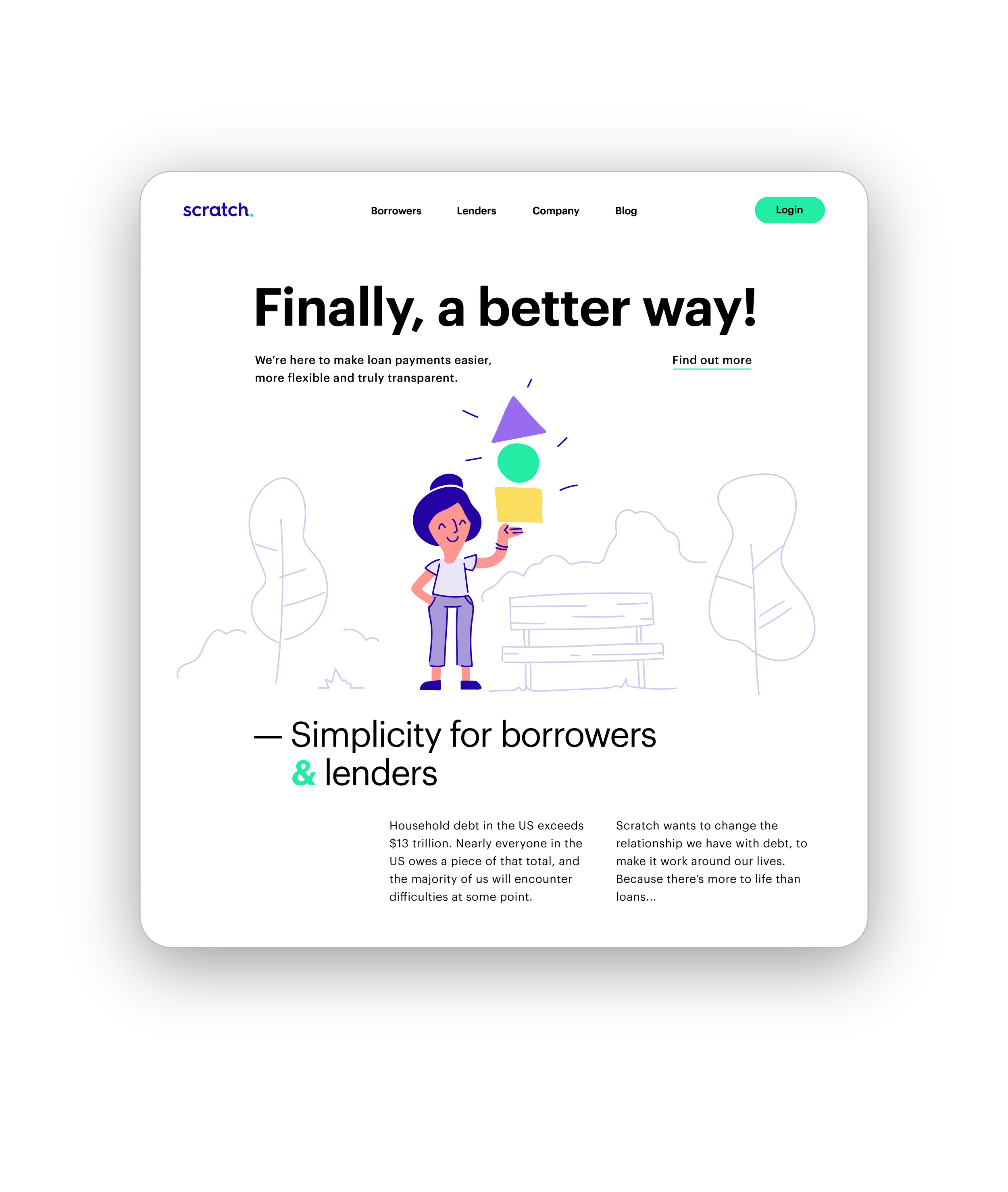
As Scratch continued to grow, so did its website. We explored a more streamlined approach to the design, bringing the brand's playful characters, colourful illustrations and visual storytelling into a cleaner, more focused experience. The challenge was to simplify the presentation without losing the personality that made Scratch feel approachable.
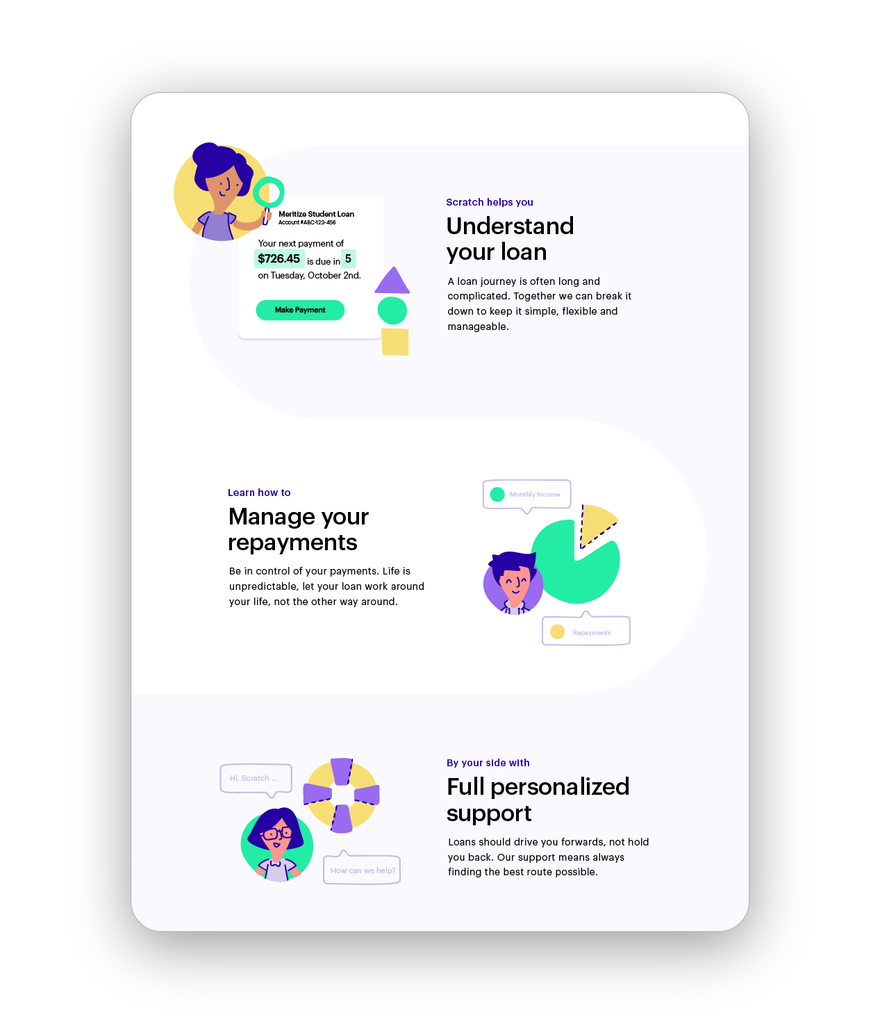
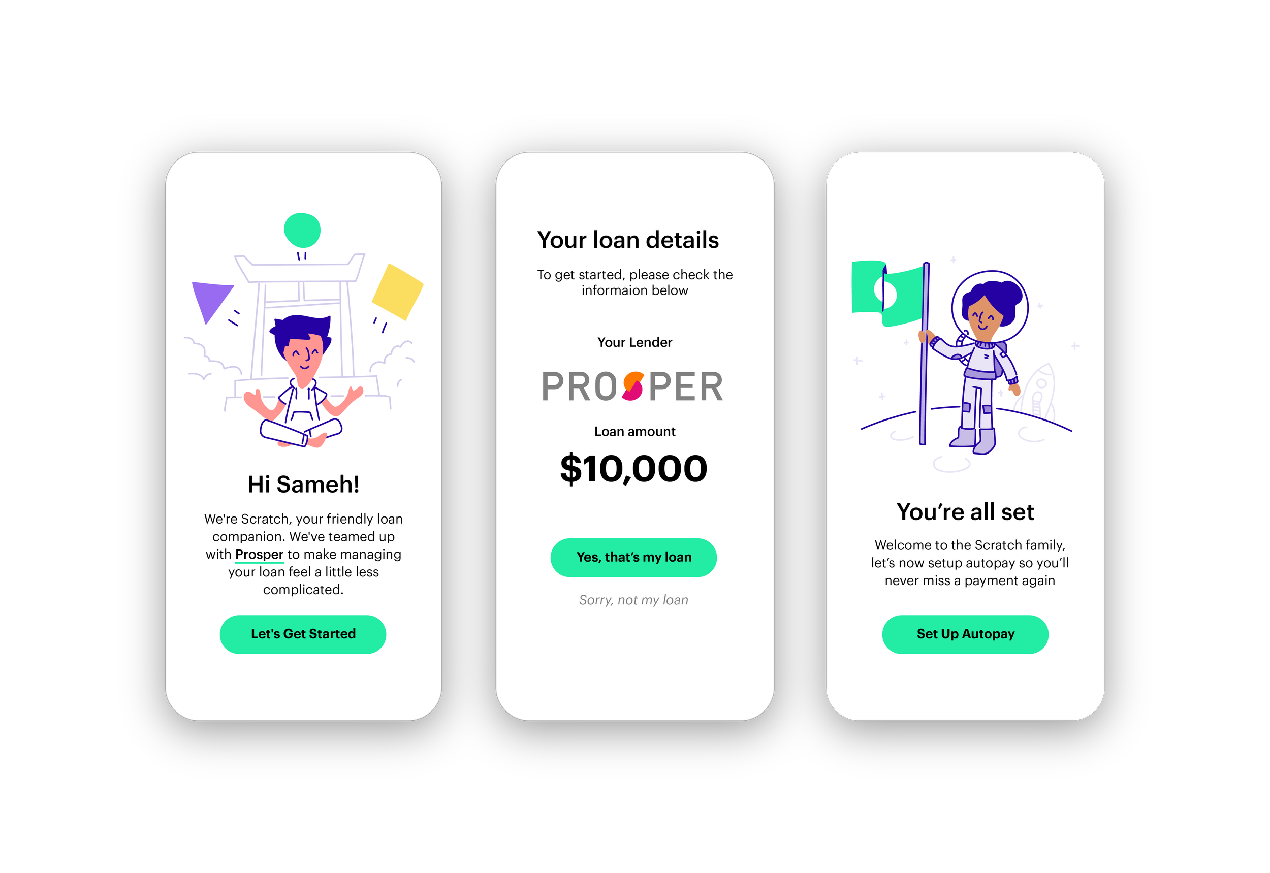
Website and mobile app concepts designed in collaboration with Simple as Milk. Illustration and character design by Vic Bell.
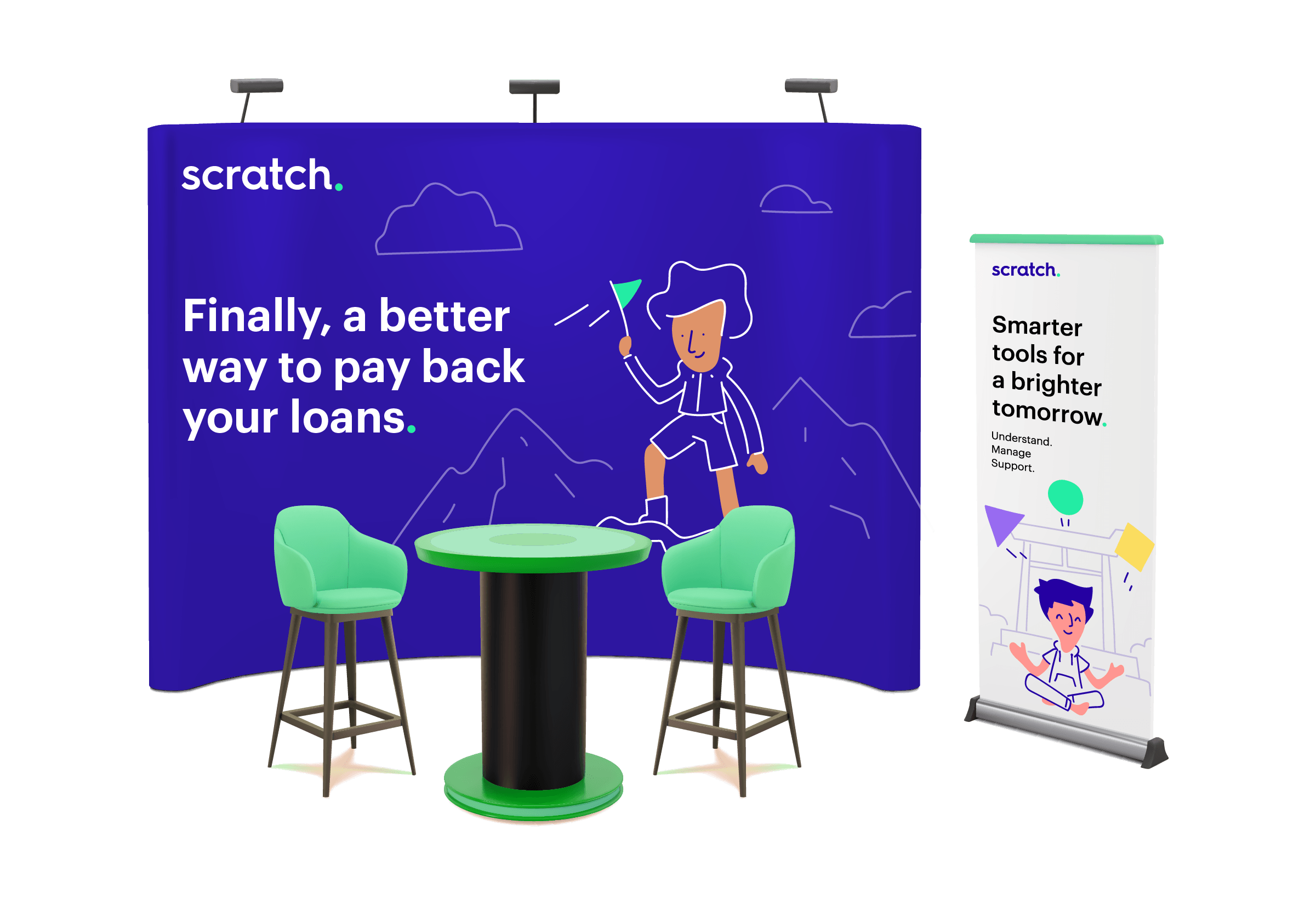
Events Out In the World
Bringing Scratch's visual identity into physical spaces was another opportunity to have some fun. I adapted the brand's playful characters and illustrations for event booths and promotional displays, creating a consistent brand experience beyond the screen.
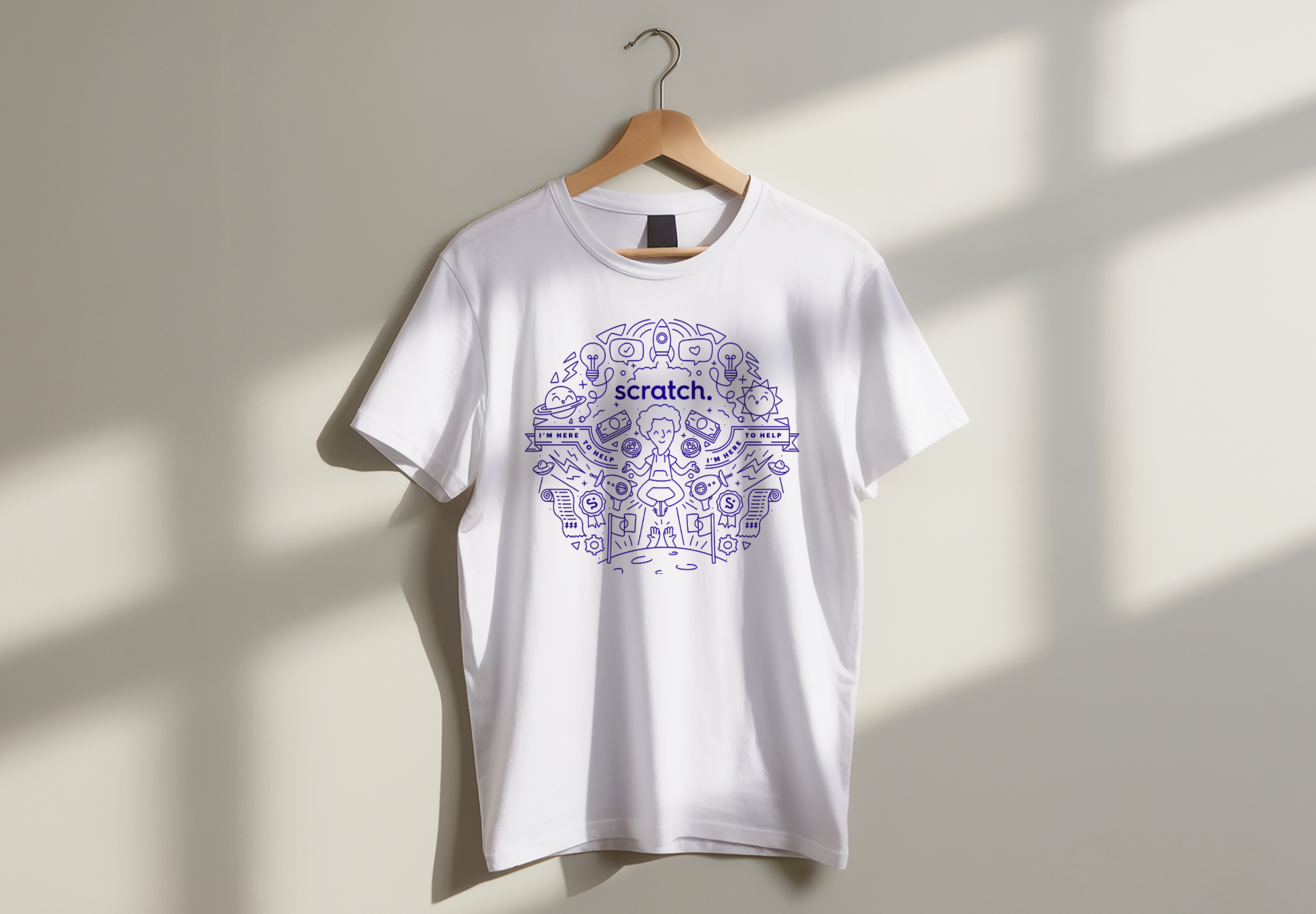
Employee Swag
I also had some fun adapting Scratch's illustration style into a detailed, single-colour design for branded T-shirts. Bringing together playful characters, typography and little details from the Scratch world, I wanted to create something that felt just as fun to wear as it was to illustrate.
“We love working with Vic, her passion for illustration is contagious and the results are stand-out brilliant every time. From planning to execution, she is a true master”
— Sameh Elamawy, CEO of Scratch
“We love working with Vic, her passion for illustration is contagious and the results are stand-out brilliant every time. From planning to execution, she is a true master”
— Sameh Elamawy, CEO of Scratch

Ϟ Shall we work together? ⌲
Whether you’re looking to work with me on a creative project, need a speaker for your event or just wanna become internet pals, I’m here!
And my email address ishi@vicdraws.comFYI •ᴗ•